
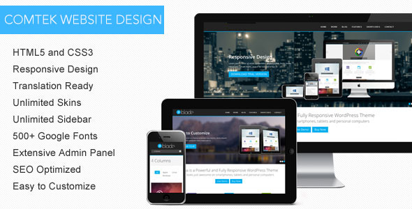
HTML5 Design

In today’s digital world, accessing internet is as simple as tapping a couple of keys on your Smartphone. With people accessing internet on tablets and Smartphone’s, creating a website of varying sizes can be quite a challenge, however with responsive website designs it can be a cake walk for sure. By using responsive html website designs we can shrink, enlarge, undo, or rearrange the website according to the users screen size hence make it accessible on all devices.
We make use of CSS3 media queries and fluid grids to create Responsive websites, with optimal presentation and design, for screens with various sizes. So your website layout changes automatically depending on the size of the screen being used to view it.
Websites developed in HTML5 animation does not require an adobe flash support on your web browser anymore. There are also ample benefits of a responsive design website over a mobile design website, as it’s a one stop shop for multiple devices. We don’t require separate URLs for the similar content hence duplication of content is minimized. Being the one stop shop for all the devices it is also extremely cost effective.


